Via Collective is thrilled to have been part of Essex Crossing, a project which recently received the 2021 AIA Award for Regional & Urban Design. Our contribution focused on the wayfinding and signage of The Market Line and Essex Market, two connected but distinct locations which serve the community of the Lower East Side, both locals and visitors alike.
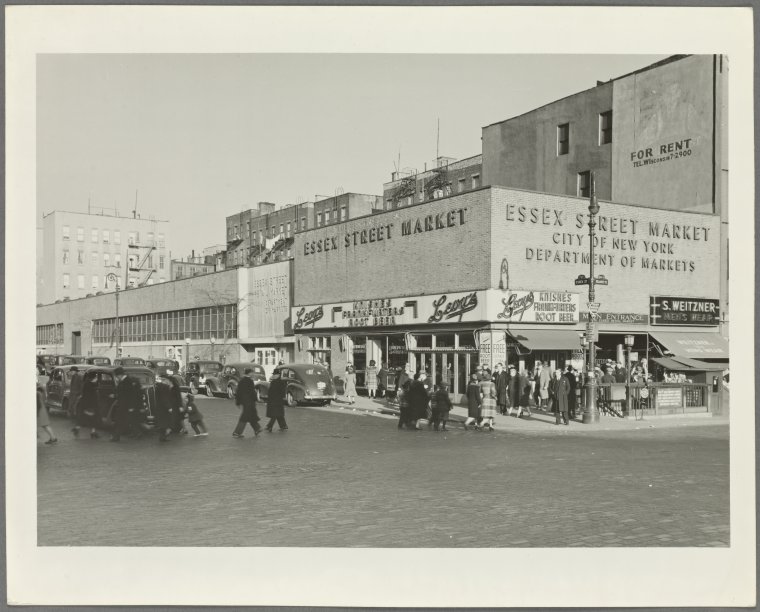
The overall design intent of the wayfinding and branding for both spaces was to connect visitors to the neighborhood around them, both geographically and historically. The Lower East Side has a rich and layered past, with immigrants from all corners of the world calling this their home for centuries. Essex Market has been a hub for the neighborhood since its inception as an outdoor market in 1818. Originally located on Grand between Essex and Ludlow, push-cart vendors sold food and sundries to the burgeoning population of the Lower East Side. In 1940, following a campaign by Mayor Fiorello La Guardia to remove pushcarts from New York City’s streets, the market was formalized and moved indoors to a building on Essex and Delancey where it remained for almost 80 years.
Essex Market 1940 | Courtesy of the New York Public Library
The current iteration of Essex Market houses both new and original vendors from the previous location, all providing affordable groceries to visitors and residents of the Lower East Side. Paired with The Market Line, a new food hall beneath Essex Market, this community has an abundant new destination for local flavors.
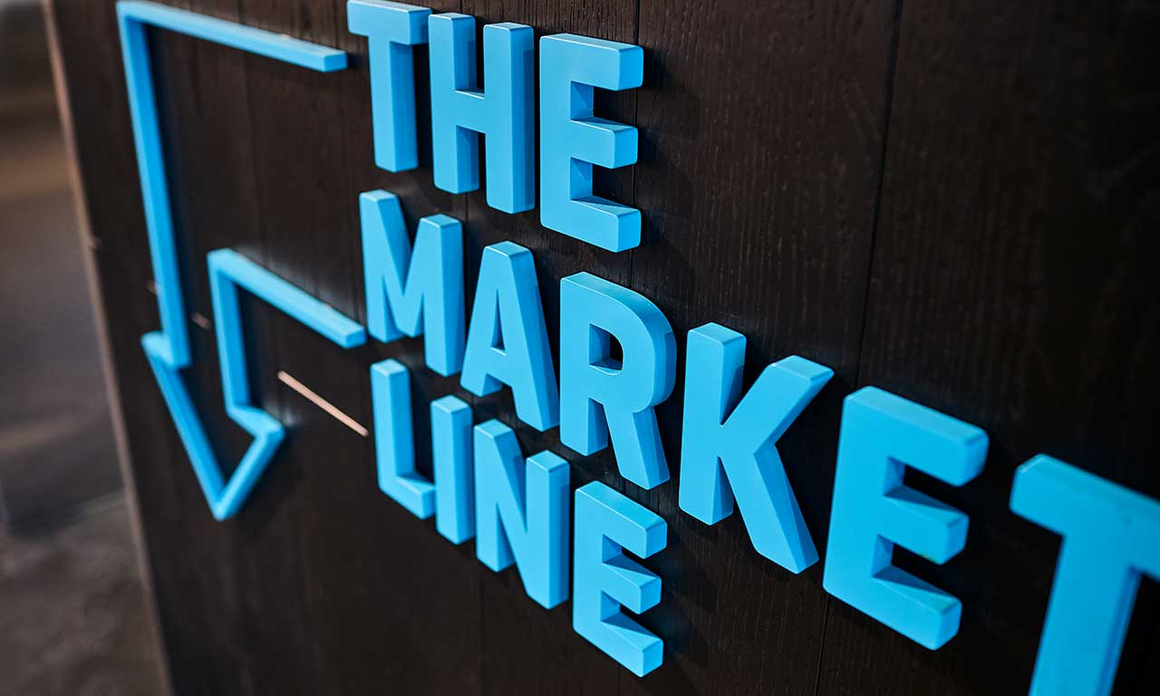
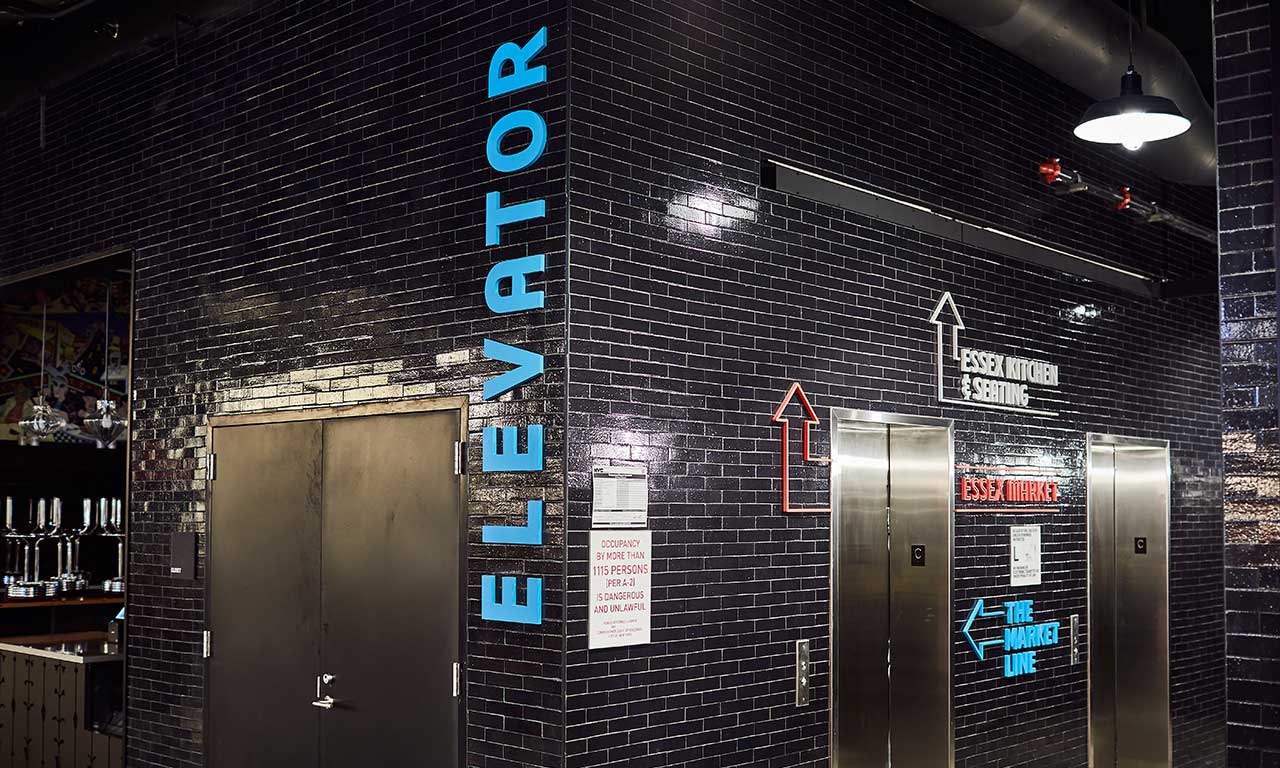
To create an immersive and layered graphic experience of the space, we designed the system to be multi-dimensional. Tactile and extruded elements not only represent the depth of the neighborhood history, but they are also a modern application that visually engages the user in a way that a flat-plaque sign or graphic could not. The font for the system, commissioned by the NYC Economic Development Corporation, was designed by Tobias Frere-Jones and is based on the sign of the 99 Essex Street Market building prior to its move to Essex Crossing.
To create a sense of place and mark the transition from Essex Market to the Market Line on the lower level, we created a visual “gateway,” wrapping beams with the Market Line logo in dimensional letters. Here a visitor will also understand the spatial differentiation by the distinct difference in color palette – the Essex Market uses a bold red as its primary color, and the Market Line is a vibrant blue.
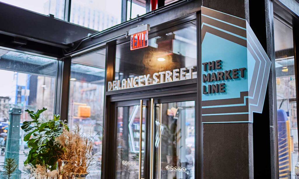
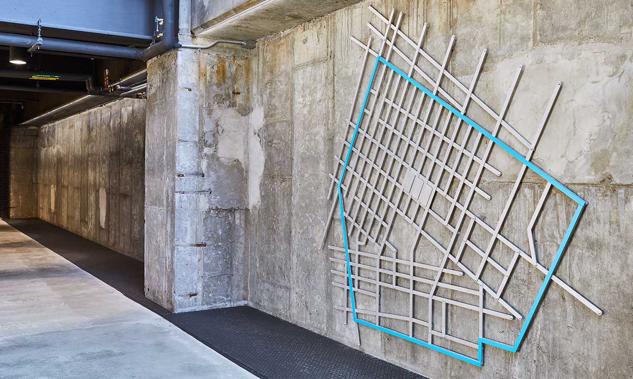
At Delancey Street entrance to the Market Line, the Market Line logo (designed by CO OP) is used as an arrow pointing visitors to the lower level. The shape of the logo replicates the shape of the neighborhood, reinforcing a sense of place.
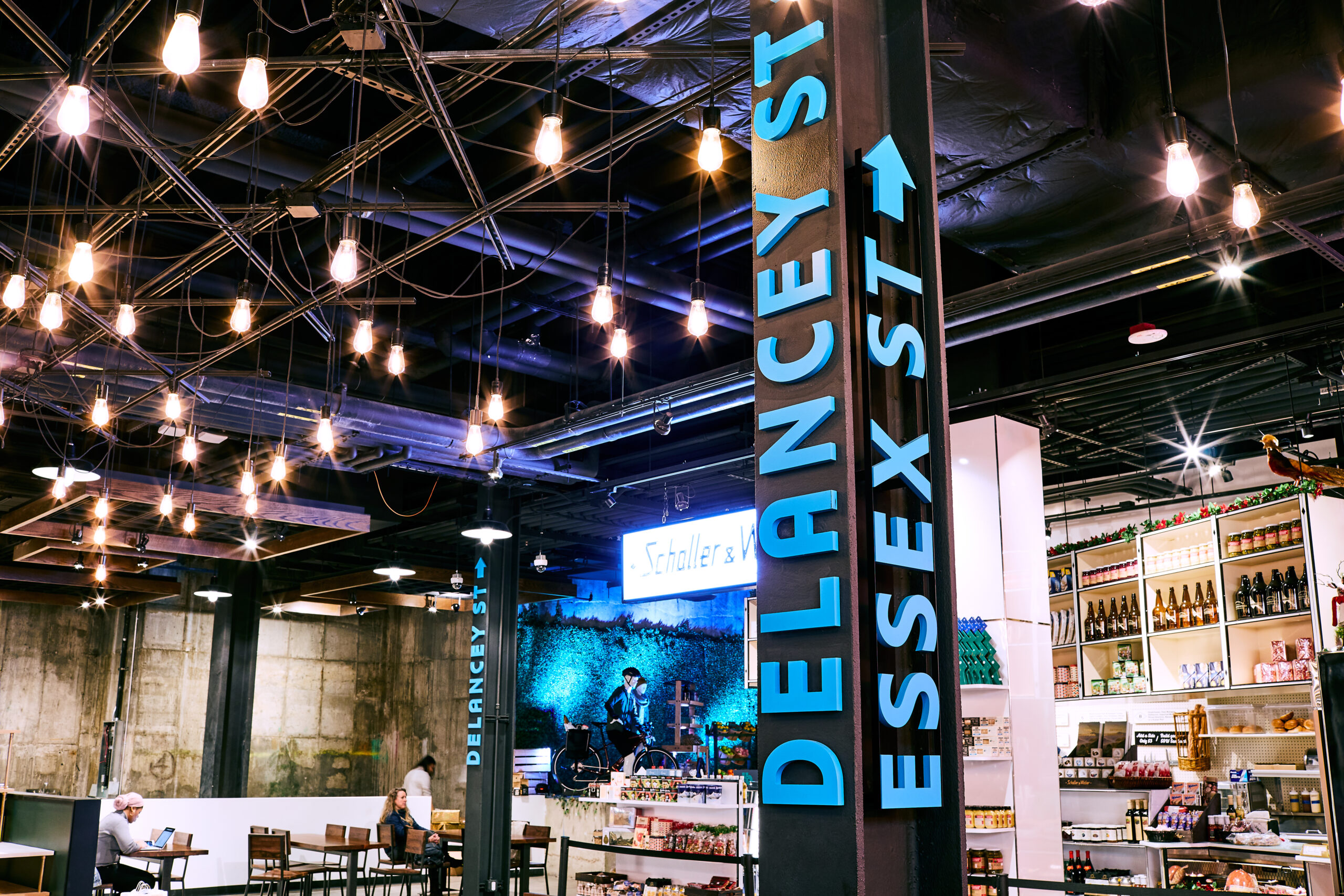
Once inside the underground space, street names in dimensional letters run up the length of columns, orienting users and reminding them where they are relative to the street level.
As a final nod to the past, we designed a large-scale photographic mural composed of historical images from the Lower East Side. We used the logo outline to create a pattern, and images provided by the Tenement Museum and other historical resources were integrated into that framework. This feature wall is located in a high-traffic area, grounding viewers in the space and history of the neighborhood.
The old Essex Market and its environs has always been a nexus for the people of the Lower East Side, and we wanted to develop a visual system that highlighted and celebrated these stories, both conceptually and literally. The result of this integrated effort is a design that not only speaks to a modern aesthetic, but also to the rich history of the location.

