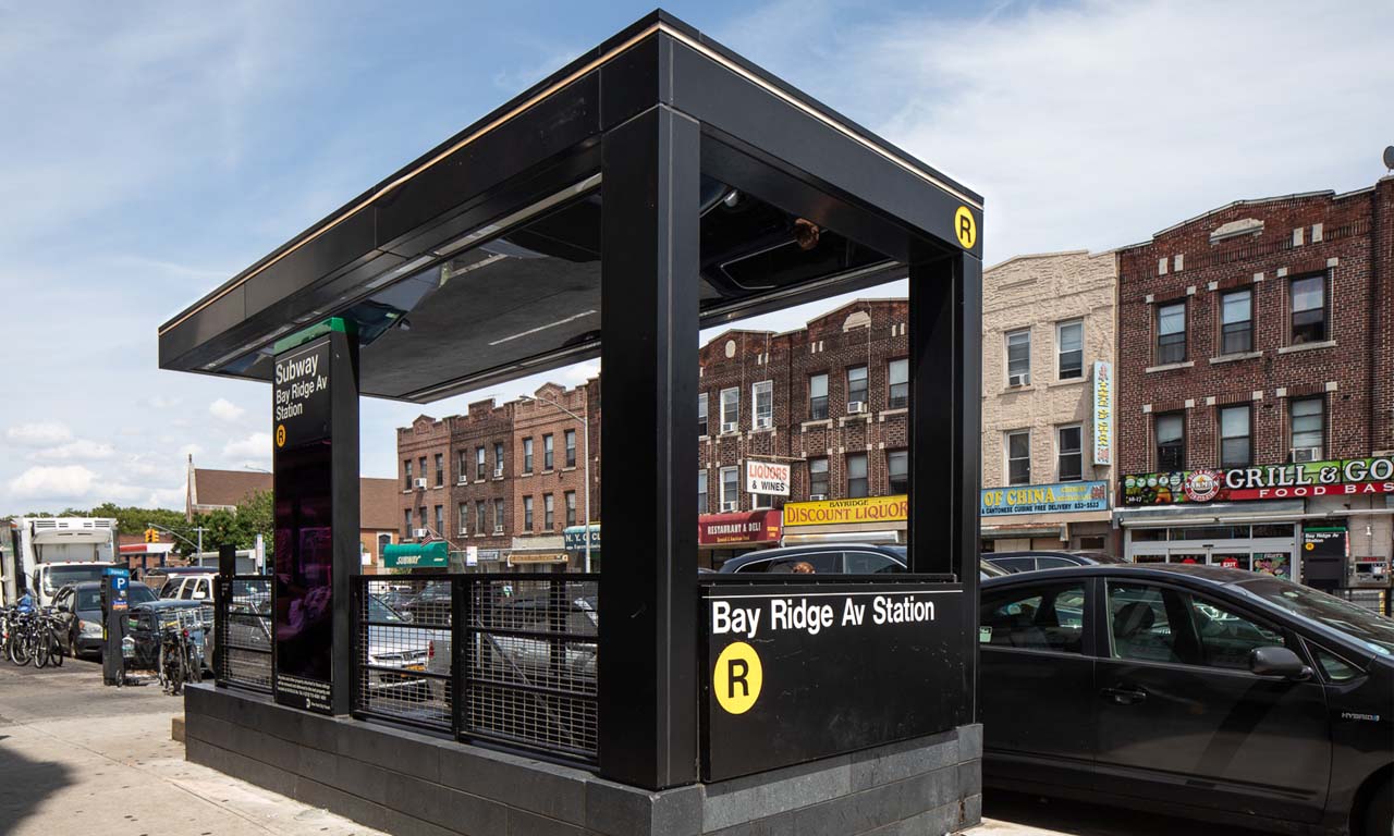
In this month’s enewsletter we discuss our extensive work in transportation wayfinding. Read the feature article below and read the full newsletter here.
Public transportation has been in the news a lot these days with ongoing challenges in the face of the pandemic, and the recent approval of the 2021 Bipartisan Infrastructure Deal. Following the principles of Universal Design, Via Collective designs for ease of use, and still believes in the power of public transit to ease commuting, encourage economic growth, and fight climate change. In cities like New York, a robust public transit system is a crucial component of daily life, but it can be difficult to navigate for first-time users or even seasoned residents during construction or when new designs come online. Designing for people and creating a seamless journey for ease of use is why we love working on transportation projects – working closely with architects, engineers, and city agencies to improve wayfinding for these critical public systems.
Navigating transportation hubs can be a stressful experience – if you ever were in Penn Station pre-pandemic you know this first-hand. The customer journey can include a lot of stops along the way: ticket machine, coffee shop, restroom, all crammed into the ten minutes before catching a train. Good wayfinding should help ease stress and ensure that customers can navigate without having to stop to look for missing information or ask for directions. To do this, a few core wayfinding principles must be applied.
PROGRESSIVE DISCLOSURE
Information overload can cause confusion for customers as they make their way through a crowded station. The principle of progressive disclosure provides information along the path of travel and is revealed when customers need it, rather than all at once. It’s about providing information from the big picture perspective and only getting to the specific detail once that decision is required. For instance, when entering a train station, the first sign a customer will encounter will direct to “Trains”, and subsequent signs will direct to Tracks 1-12 or Tracks 13-19 when those choices need to be made.
INFORMATION HIERARCHY
Information should be prioritized and presented in a consistent hierarchy so that primary, secondary, and tertiary destinations are clear. The divisions are generally based on importance to the user journey. For example, in a train station the primary destinations might be the tracks and exits, secondary might be multi-modal connections such as subway or regional rail, and tertiary might be customer services like restrooms or waiting rooms.
SYSTEM-WIDE CONSISTENCY
Consistency across a wayfinding program is essential as it reduces confusion and builds customer trust. This means that the naming conventions, color application, information placement, and iconography should be the same across the entire system so that users have an intuitive understanding of the system logic. A positive customer experience is often measured by the sense of safety and security the person feels moving to their destination. At Via Collective, we often say that you won’t even notice the wayfinding if we’ve done our job correctly!
Photo credit: Assaf Evron

