In this month’s enewsletter we discuss how wayfinding extends beyond the physical boundaries of architecture. Read the feature article below and read the full newsletter here.
The appointment. The street corner. The invitation in the mail. These can all be the first step of a wayfinding journey, however, our scope of work rarely begins here. Wayfinding projects are usually constrained by the architectural boundaries of a site – limitations governed by owners, budgets, or physical space.
Building walls, property lot lines, bound by streets and avenues – are all the common ways to delineate space. It certainly makes sense to define the built environment in this way, but visitors will experience space in continuity, traversing these invisible borders as they move from one place to another. One major challenge we face is how to align wayfinding systems outside of the architectural scope of a project – connecting buildings, streets, or even a website to the location we are designing for. Our job as wayfinders is to advocate for the user, proposing creative ways to overcome the limitations defined by the project scope.
WAYFINDING STARTS AT HOME
Today most people will look online before they head out to a new destination. They will map it on their phone, or visit the website. This may be the first time they are familiarizing themselves with the names of the location, various destinations within the site, and the route they will take. That is why it’s important that consistent nomenclature and visual graphic language is used on all materials and that destination names are the same. For example, when designing wayfinding for The Market Line, we took a cue from the existing logo and created a bold threshold sign that directs visitors to this subterranean food court. The logo can be found on the front page of The Market Line website, so it’s familiar and obvious as soon as visitors arrive.
WAYFINDING UNIFIES EXPERIENCE
Consistency of wayfinding across complex spaces that are separated by function, agency, or even distance is especially important. Though there may be multiple buildings or uses in a complex, if it’s considered a single structure such as a hospital that consists of multiple buildings, or airports with multi airlines, people will expect a unified wayfinding experience. Consistency across the entire system fosters familiarity and trust – this was a key principle in designing a new wayfinding signage system for the renovated Long Island Rail Road Concourse in Penn Station. Rather than create a stand-alone system for LIRR, we aligned the graphic language with the new wayfinding system that was recently installed in Moynihan Train Hall. This means that if a person is moving from Moynihan to the LIRR Concourse, they will see the same color-coding, destination names, and icons.
WAYFINDING BRINGS PEOPLE BACK
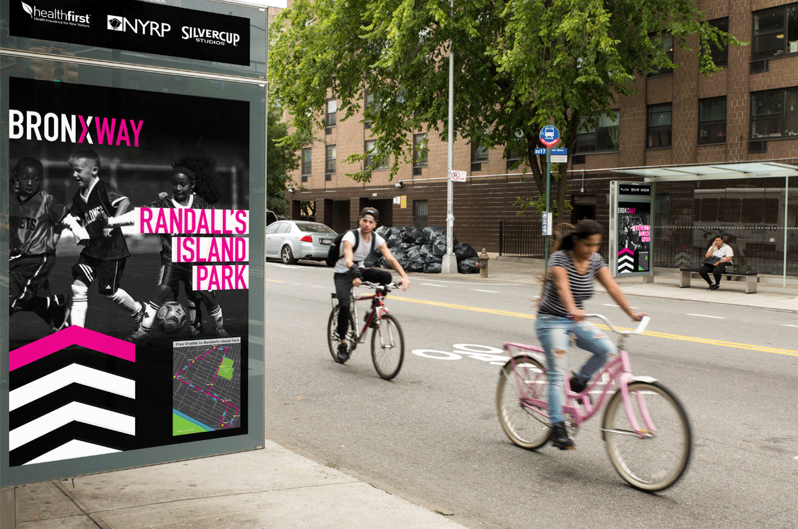
Successful wayfinding is critical to a successful visitor experience. People do not want to return to places where they felt lost or confused. One of our first large-scale projects was improving the wayfinding access to Randall’s Island Park. As part of the initial research phase, we tasked several visitors to walk to Randall’s Island and record their experiences. Inconsistent nomenclature and unclear identification signage contributed to their frustration, with one participant summarizing his video with the recommendation “don’t walk!” With this feedback, we worked closely with the Randall’s Island Park Alliance to implement a comprehensive wayfinding system which, when paired with new park programming, contributed to a dramatic increase in park visitors in 2013. This work also formed the foundation for our collaboration with New York Restoration Project’s Haven Project, where we worked with communities in the South Bronx to reinforce the connection between Randall’s Island Park and its adjacent neighborhoods.
Image by Via Collective

