Typography is having a renaissance. Once limited to a specialized group of individuals with knowledge of letterform design, the advent of the digital age has opened the door to a flood of enthusiasts, and typography as a discipline has exploded in popularity.
Typography permeates our lives both online and in the real world, and though you may never notice it, it shapes how you process written information. Simply put, typography is the “art and technique of arranging type.” It is an essential element of graphic and wayfinding design and determines if the information presented is accessible to, and memorable for, the reader.
When designing wayfinding systems, a typeface is selected for the context of a project. We take into account not only the users of the system but the environment for which the system is created. For example, when designing directional wayfinding in complex, high-stress projects like city streets, airports, or hospitals, we would opt for a typeface with more legible characteristics like open counters, uniform stroke widths, and a tall x-height.
In projects where the setting is more relaxed and the typeface can respond to a more stylistic impulse, such as parks we would recommend something that aligns visually with the brand, history, or aesthetic of a locale. That said, we always want to select typography through the lens of accessibility – scale, contrast, and color always play a critical role in determining the clarity of messaging.
PRIORITIZING LEGIBILITY WITH FRUTIGER
In 1968, one of the most recognizable sans serif typefaces in use today was born. Adrian Frutiger was commissioned to create a bespoke typeface for the new Charles de Gaulle international airport in Paris, based on the success of his sans serif typeface Univers. He developed this new typeface with clarity in mind – the letterforms had to be easily recognizable at various distances and angles from both walking and driving. Today this typeface, named Frutiger after the designer himself, can be seen in use around the world, from its birthplace at Charles de Gaulle, to John F. Kennedy International Airport, to the Bay Area Rapid Transit (BART) system in California.
EVOKING THE PAST WITH ESSEX MARKET
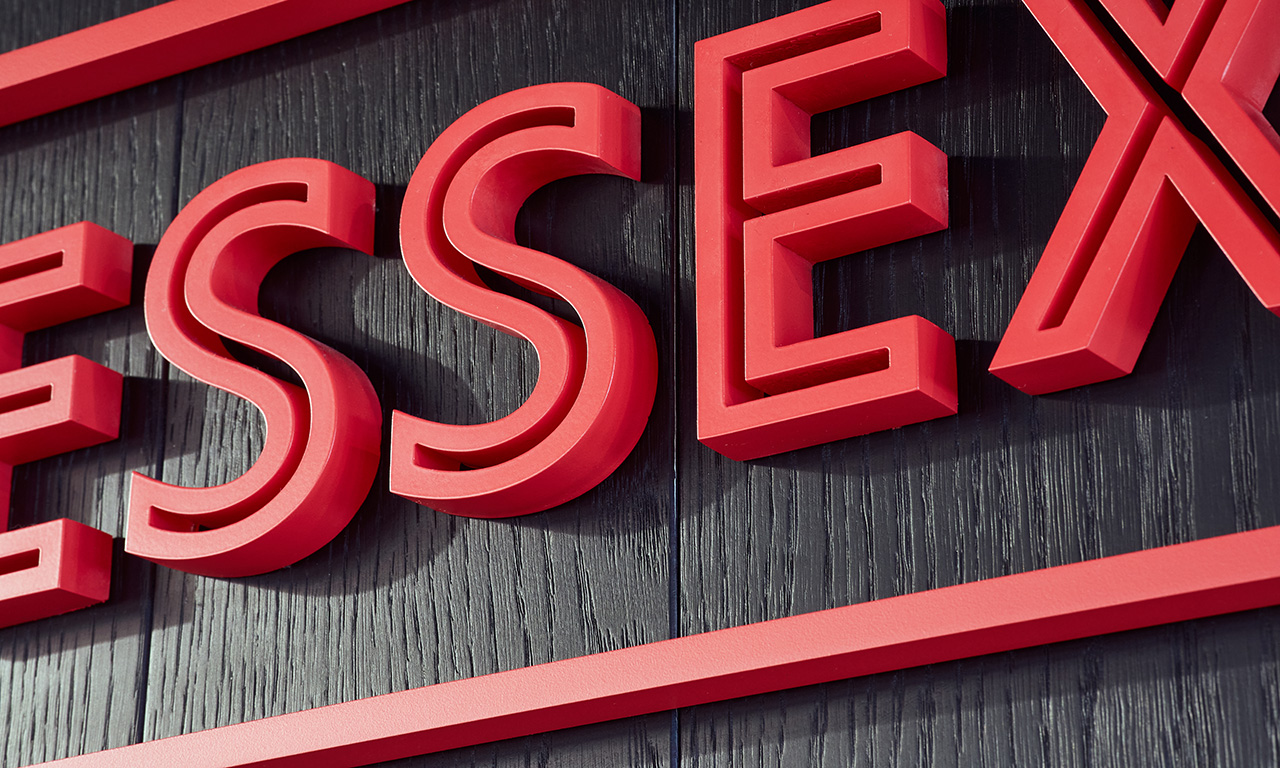
When New York’s Essex Market was relocated to Essex Crossing after more than 80 years in its previous location, the developers knew they wanted to preserve the legacy of this historic Lower East Side gathering place. To do this, they engaged type designer Tobias Frere-Jones to develop a typeface that would not only be the new voice of the market but also evoke its past.
Frere-Jones embarked on a journey with Nina Stössinger and their team of designers to delve into the history of the market, unearthing one of the original signs which would serve as the inspiration for this new typeface. The letterforms of the final design harken back to the “gaspipe” style of lettering found across old New York, and an inline reminiscent of the neon from the original Essex Market sign. This typeface was used across the entire Essex Market project, from the built environment to the branding materials, and we used it in the wayfinding system for the lower level Market Line as well.

