We are proud to commemorate the passing of the Americans with Disabilities Act 33 years ago, one of the most comprehensive pieces of legislation ensuring equal opportunity for Americans who are disabled. One in four Americans live with a disability, and many more of us will experience temporary periods of disability throughout our lifetime.
The ADA was truly a watershed moment in ensuring equity for those with disabilities, and it is a cornerstone of architectural and wayfinding design today. At Via Collective, we are passionate about being active contributors to a more accessible future.
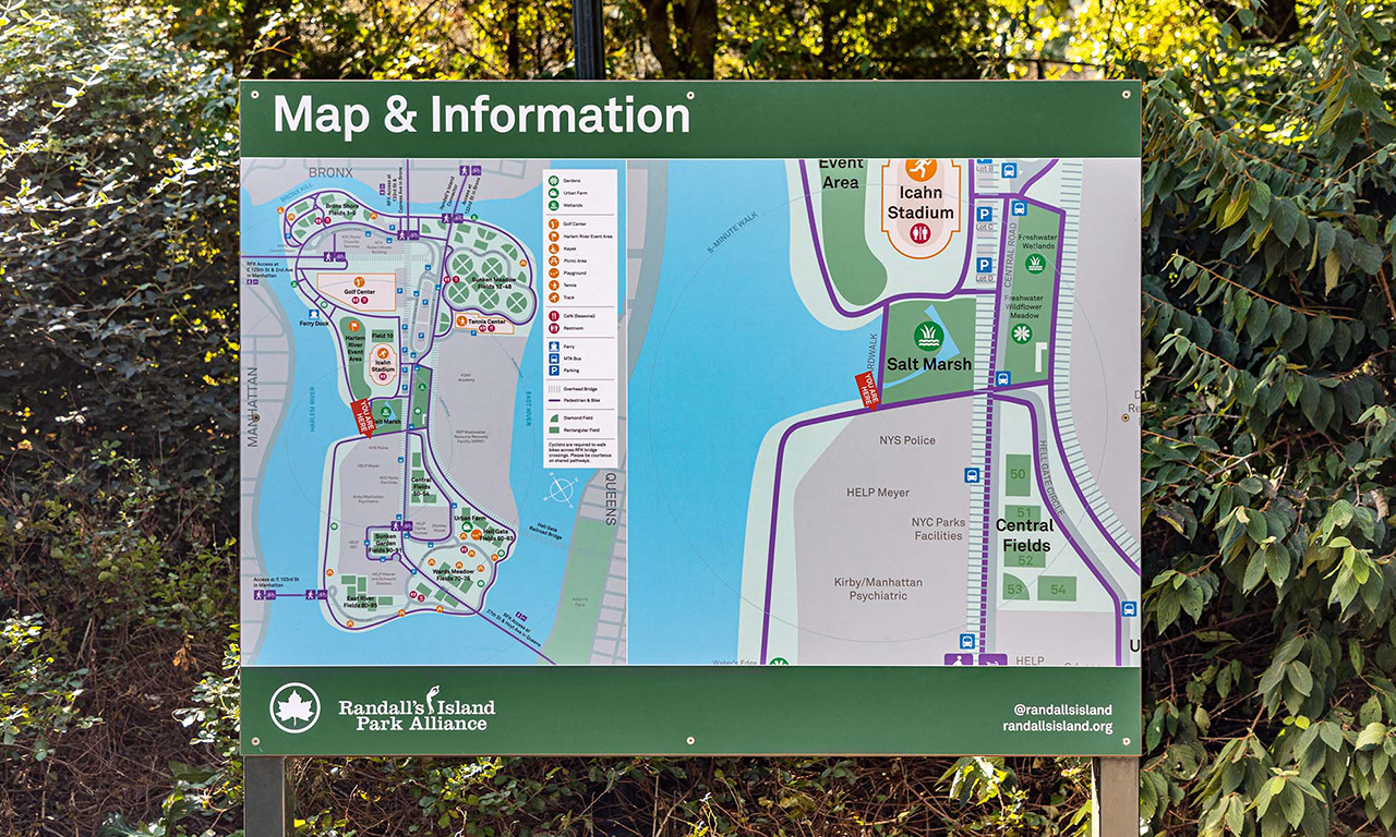
Typography is one of the essential, yet often overlooked component aspects of shaping accessible and effective wayfinding experiences in the built environment. Even the most beautifully designed spaces won’t be enjoyable for visitors if the signs aren’t legible and the wayfinding isn’t intuitive.
The scale, color, contrast, space between the lines and the letters all impact how readily we ingest information. Within wayfinding design, these qualities help determine if the information presented is accessible to, and memorable for, the reader. Graphics and symbols aid in the comprehension, especially when considering an audience that includes a variety of language proficiency.
Jonathan Paul Katz, Policy Advisor with the Department of Labor, noted that typeface, color, words, and graphics are among several characteristics that make wayfinding and signage accessible for everyone. For instance, “Sans-serif fonts are easier for people with many vision disabilities and dyslexia to read, and straight-line fonts are much more readable for people with vision disabilities and some cognitive disabilities.”
Though the ADA and its amendments ensure a basic standard for accessibility, good wayfinding goes beyond these requirements to make access truly universal and inclusive for everyone.

