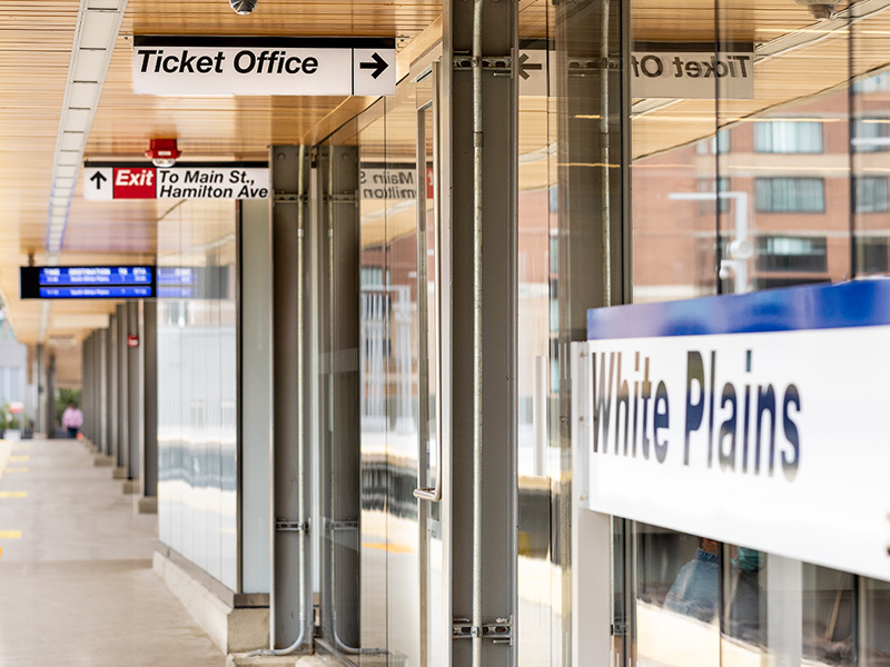
In our digital world screens and devices often dominate our experience. The seamlessness in which we interact with these experiences calls attention, though quietly, with a level of craft or consideration involved. A poorly designed or considered interface is immediately obvious and feels jarring. Leaving us feeling frustrated and impatient. User experience (UX) design provides a design process to help enhance a user’s flow through a digital experience. One could argue that the real world manifestation of this is wayfinding.
Much like UX design, wayfinding seeks to enhance the user experience and there are a variety of parallels to be considered between them. Both aim to contextualize a user’s interaction within space. Whether that be a grid of pixels on a screen or the winding corridors of a hospital, they assist in one’s ability to orient and navigate towards destinations or information.
In navigating the built environment, we often encounter challenging experiences. Frustration and potential impatience can be felt at our most crucial moments. Late to your flight and cannot find the gate? Trying to locate a restroom? Taking the wrong turn or exit? It is often taken for granted, in these relatable scenarios, that signage and wayfinding are an integral part of a fluid experience. Ease and simplicity of navigation leaves it feeling invisible. Just part of the built environment when done effectively.
This sense of invisibility stems from a lack of awareness of a system. People understand that connected screens are part of a broader flow of components that are architected for an experience. However, when it comes to the built environment people do not even consider signs as a separate discipline. If they do, they think “sign” not “a wayfinding system”. Signs are often considered in isolation. A singular wall mounted sign or overhead that provides you with information. This isolated interpretation is understandable as if you are looking for a rest room and find it thanks to one sign then the sign is successful.
The lack of awareness of a system can be due to fluid boundaries, lack of spatial directions, indistinguishable landmarks, or inconsistent qualities of information within a wayfinding system. Unlike an app with specific screens, a wayfinding system could be as direct as a single corridor within the interior of a hospital to as vague as a campus with porous relationships with the town around it. These relationships therefore present a variety of challenges for a consistent user experience across many entry and decision points. However, one principle that solves for consistency and is unchanged across digital and wayfinding is branded cohesion.
As mentioned, wayfinding is not just a couple of signs but a collection of sign types and consistent information that operates as a system. Like digital UX they are built out of a signage guideline or brand guideline which includes colors, typography and symbols. When applied thoughtfully and accurately nothing feels out of place. The signage aids the architecture in creating a sense of place, whether that be an airport or hospital. Each place has its own aesthetic styling or design tropes that affect user experience. Unless you’re at Disneyland, wayfinding systems often are not exotically thematic or overtly expressive. They revel in subtlety and lean into a pragmatic and direct aesthetic to allow the user to enjoy the experience they are there for; catching a plane, visiting a doctor, attending a class. The consistent application of typographic treatment, symbols and use of color, all serve to delineate information in the same way. App pages do not suddenly use random fonts or layouts as you go through an experience and wayfinding systems should be no different.
In exploring the parallels between digital UX and wayfinding. We can see how craft and considered application of brand guidelines and thoughtful engagement with the architecture which focus on the user’s journey, creates a place that can enhance their experience. This leaves them feeling empowered in navigation, frustration free in arriving on time, and not noticing a thing was wrong.

