Designing wayfinding and signage programs require a series of assumptions and testing those assumptions against reality over the course of the project. Opportunities to be on-site, connect with other disciplines and collaborators, and study samples and prototypes are all invaluable in confirming or reevaluating those assumptions along the way.
We recently completed a signage and environmental graphics program for the NYU Martin Scorsese Virtual Production Center (MSVPC) in Sunset Park, Brooklyn. The project had a collaborative, communicative team of clients and partners that were all committed to the transformative possibilities of signage and graphics in the new space. We were unified around a design concept early on, and over a year-long process, worked together to bring the design to reality. The project was a case study in the value of iterative design, proving that even with sharp clarity in the design concept, the design will evolve through implementation.
As we move through the typical phases of the design process—Schematic Design, Design Development, Construction Documentation, and Construction Administration—we have opportunities to evaluate and refine our design intent. Ideation in the beginning of a project—during the Schematic Design phase—is iterative and open, sifting through concepts that can effectively communicate the space(s) and to the users that navigate it. A project’s conceptual design can be informed by many things, some objective: architectural design and finishes, brand graphics, others more subjective and difficult to define: emotion, tone, and atmosphere.
During Schematic Design, we isolate a concept that will form the conceptual basis for all decisions that follow. As we move through the phases of design development, we are trying to maintain the integrity of that original idea as much as possible. As that original idea is refined, we document it through drawings that illustrate our design intent.
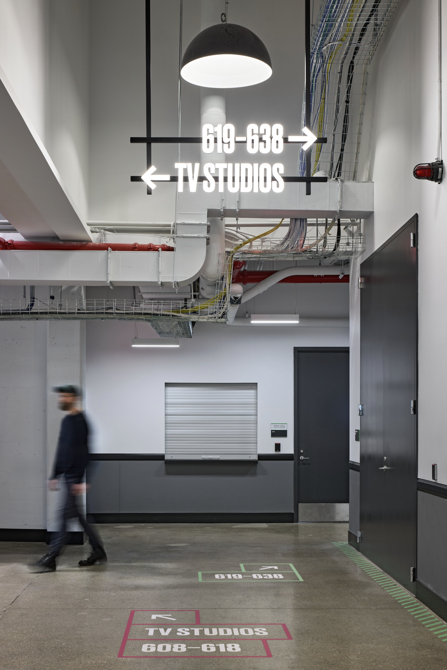
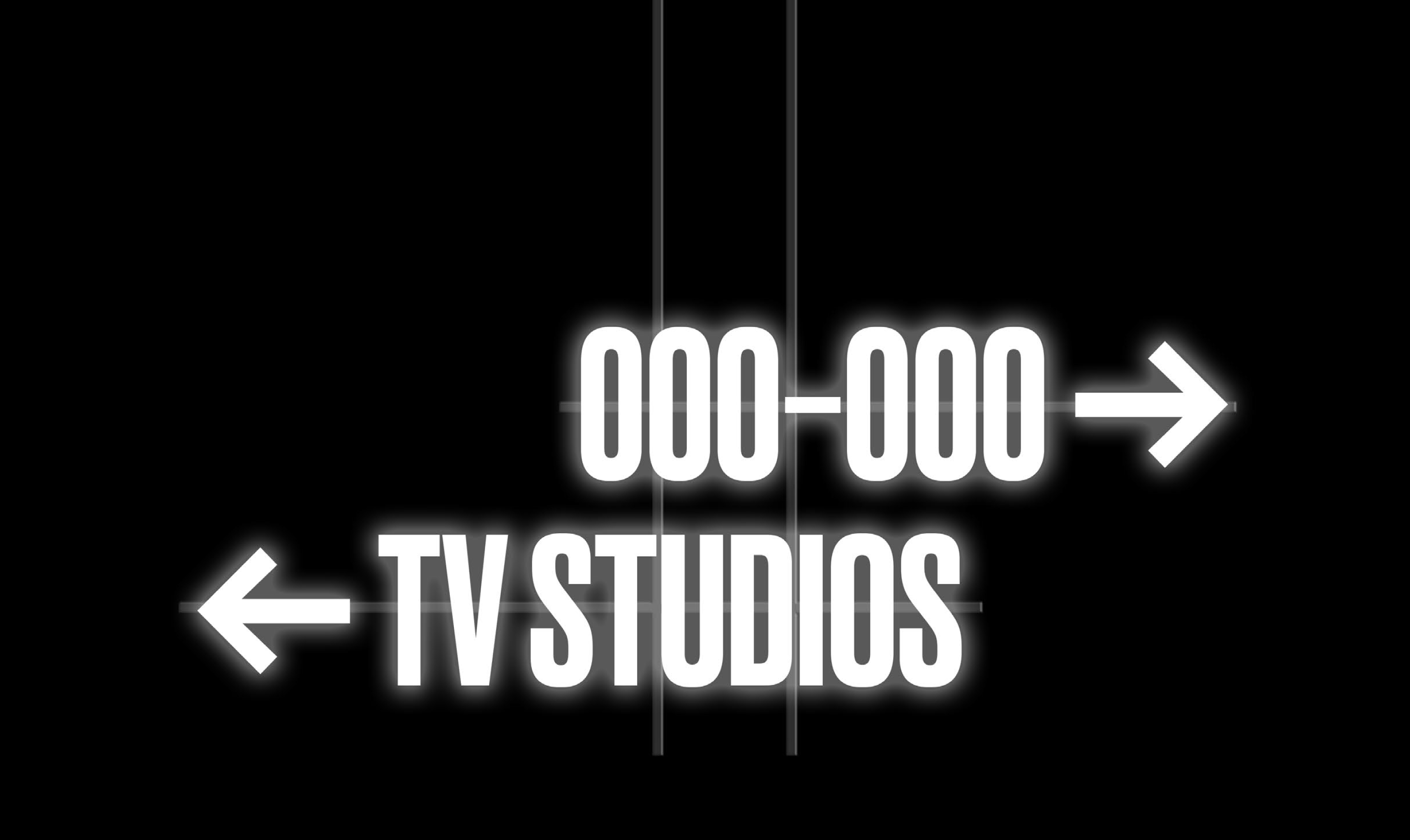
Our original concept drawings for the MSVPC illustrated ideas that would anchor the project: use of materials and typography that would explore the fundamentals of photography like light, shadow, and depth; as well as the rough-and-ready “workshop” qualities of a film set: brightly colored gaffer tape and floor graphics.

As we documented the design into a Design Development drawing set, we studied the architecture and spatial constraints, understanding the tolerances available for our design. While the Schematic Design was conceptual in nature, here we identify the construction-intent of each sign type, scale, materials, and finishes. These drawings act as a common reference point for all forthcoming communication with our clients and fabricators, providing dimensions and design information for us to understand pricing, nuance of material and finishes, and spatial constraints.

Our design concept organized the space around color-coded gestures. The signage color palette referenced both historic and contemporary sources: the industrial architecture and finishes of the building (including seafoam green mullions), and the furnishings that would populate the new space. Prior to looking at working prototypes, we review finish samples in order to dial in the accuracy and relationships of color.
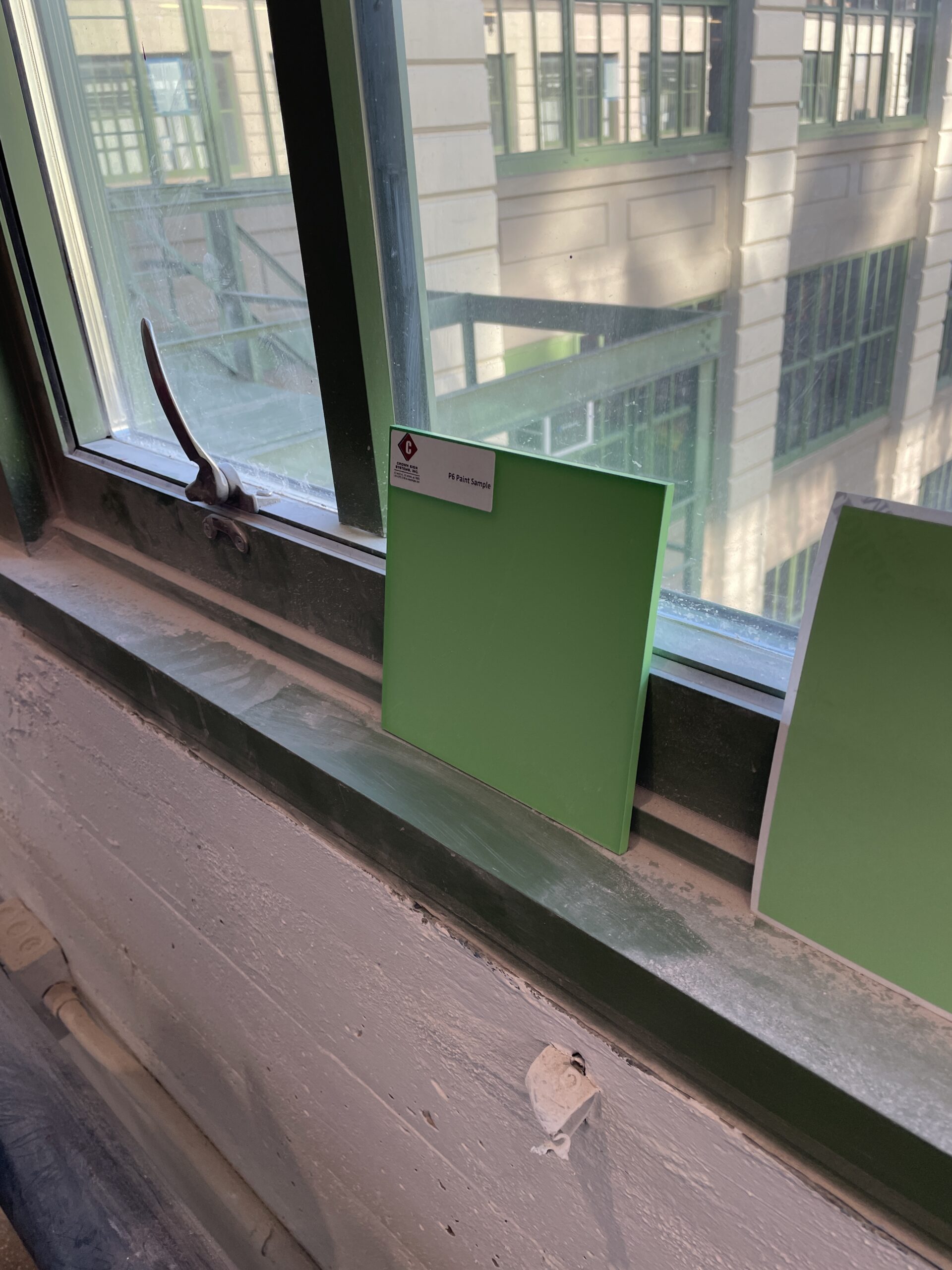
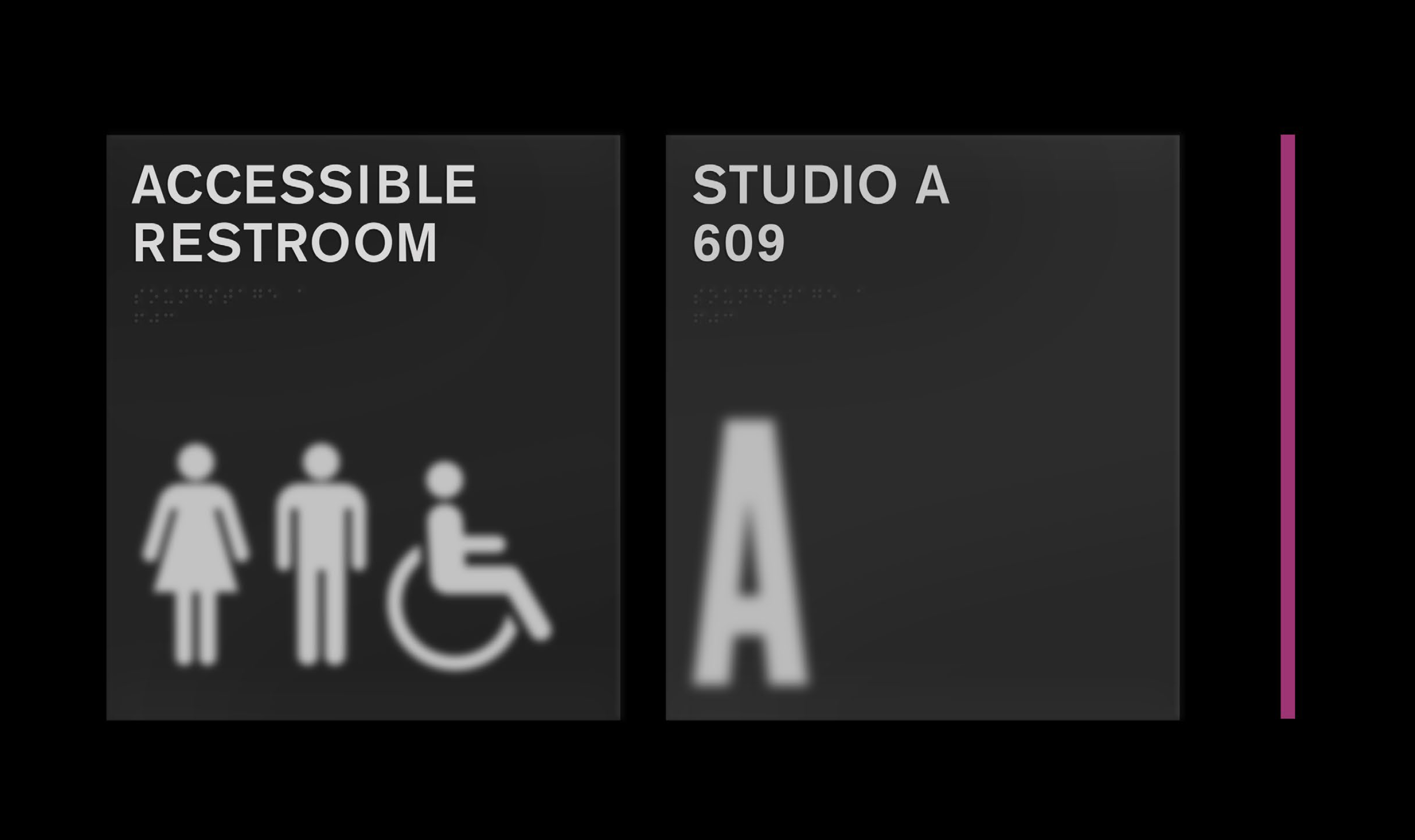
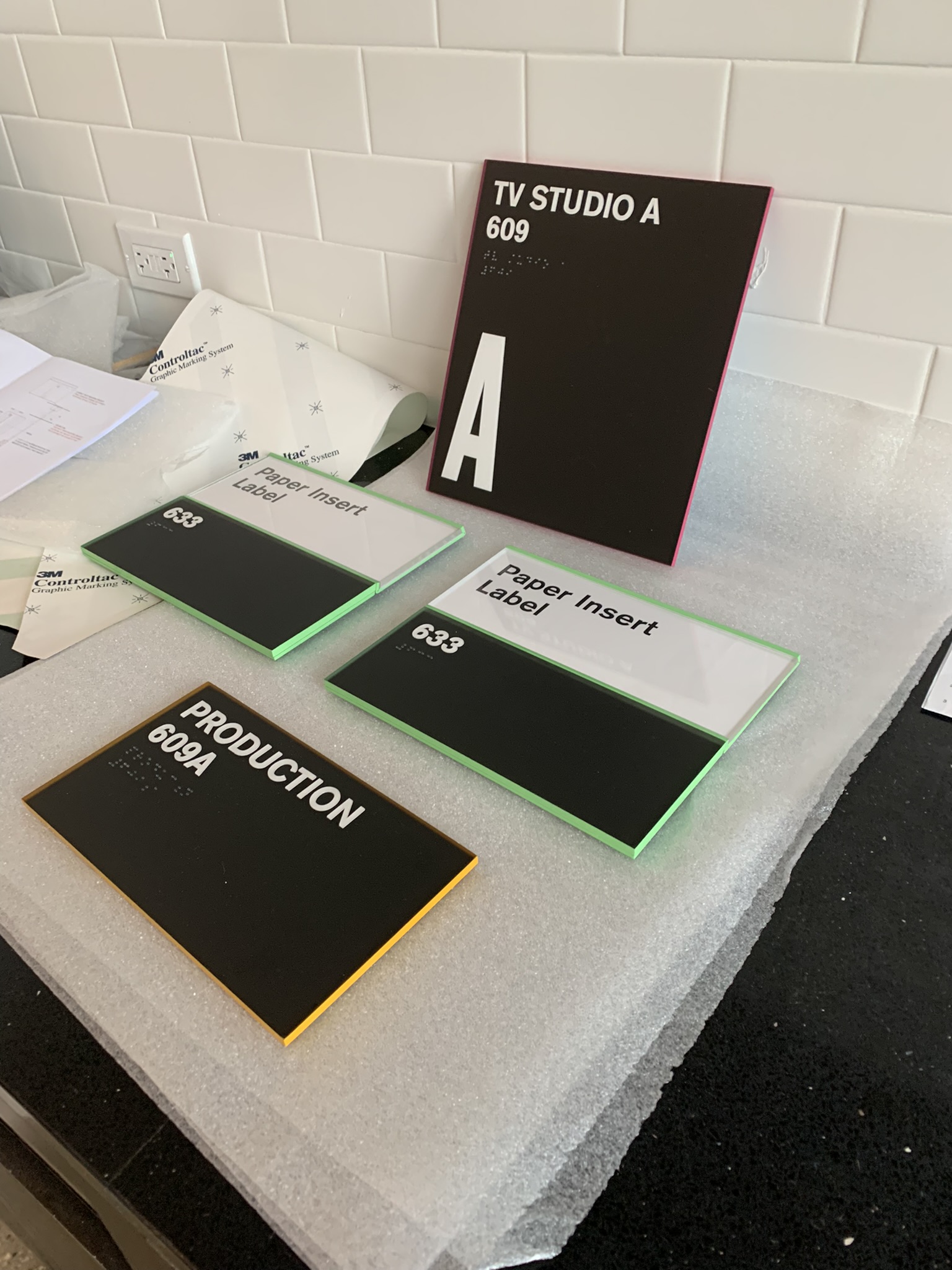
The original design concept of the room identification signage suggested applying paint and graphics to both sides of a piece of frosted acrylic, illustrating the interplay of focus and depth of field in film and photography. In order to confirm the accuracy of this effect, we reviewed color swatches against different translucency levels of acrylic.
We take our learnings from the sampling process into Construction Documentation, in which we prepare a 100% drawing set defining the exact specifications, installation conditions, and quantities of all signage to be installed in the space. Now that all aspects of the design have been defined, we can review full-size working prototypes of all signs in the system. This is another opportunity to review our design in the reality of the space, rather than through the intent of the drawing. Sometimes the assumptions about scale, illumination, or color made through the drawing process don’t feel quite right, and we embrace the nuance in these learnings to better refine the design.
At the MSVPC, some of the biggest graphic gestures were large, illuminated, suspended signage. When we brought full-scale partial prototypes into the space, reviewed against recently installed ceiling fixtures, we understood that these signs would need to be redesigned through scale and installation position in order to have the impact we intended, but comfortably integrate with the architecture. This was also an opportunity to understand the interplay between multiple sign types in the system: critically in this case, the relationship between the ceiling, floor, and wall graphics.
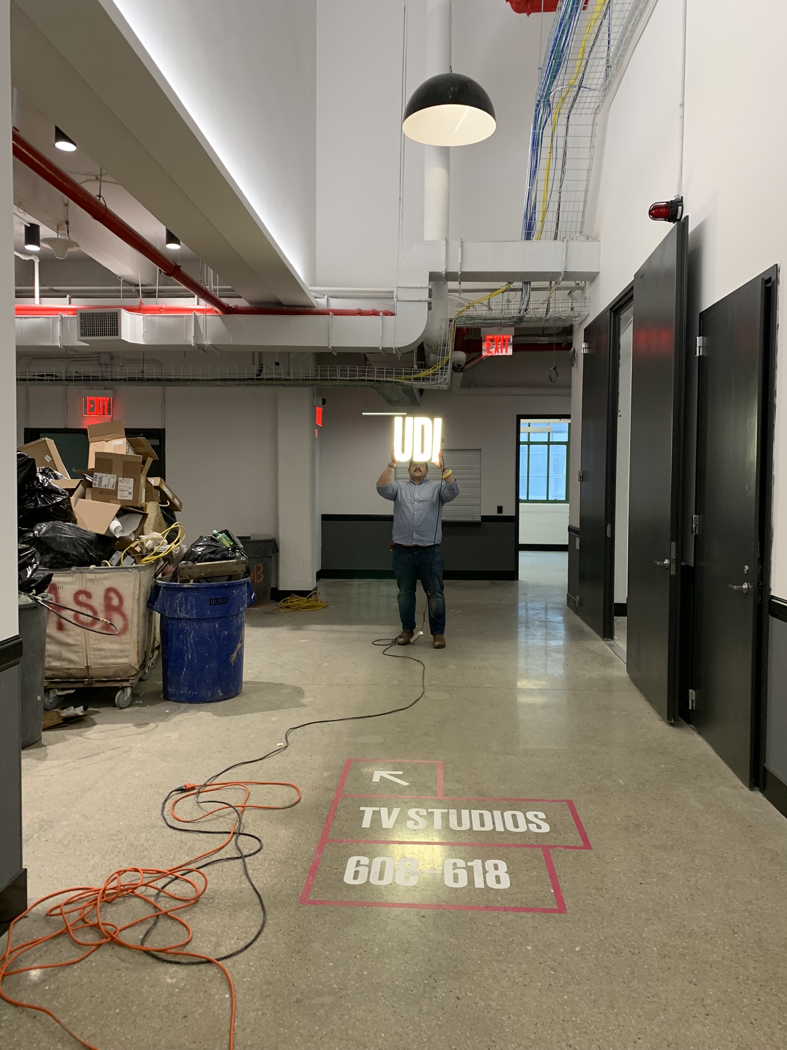
Throughout the prototype process, we document all of our observations and revisions. In some cases, such as at the MSVPC, the outcome of this process results in changes to the design drawings. These are documented through clarification sketches or drawing set revisions, and communicated directly to the fabricator.
This process concludes in a shop drawing review, in which a drawing set from the fabricator that documents all final components of the design to be fabricated, is approved. The signage and environmental graphics at the MSVPC ultimately followed closely to the original design concept. Yet while the distance between drawing and reality can be nuanced and nominal, the iterative process of sampling, drawing, prototyping, and on-site review is invaluable to avoiding surprises—and a successful installation.