
In the everyday details of public spaces, signs often reveal how language, culture, and design intersect. At JFK Airport Terminal 5, above, bilingual signage demonstrates how information can be translated clearly and efficiently for diverse travelers. Each destination or service—such as parking, taxis, transit to the city, ride app pick-up, rental cars, and hotel shuttles—is paired with its Spanish equivalent directly beneath the English, creating a straightforward one-to-one relationship. Icons further reinforce meaning, offering quick visual recognition regardless of language proficiency. The consistent use of hierarchy, color blocks, and spacing separates the information into clear fields, ensuring that travelers who rely on either English or Spanish can navigate with equal confidence. In this way, the sign serves not only as a tool for direction but also as a signal of accessibility and inclusivity within a global transit hub.
How Words Shift Across Borders
Moving from New York to Bogotá, multilingual signage reveals a more complex interplay of language and culture. At a medical facility just north of the city, Spanish appears as the primary language, with English included as secondary.
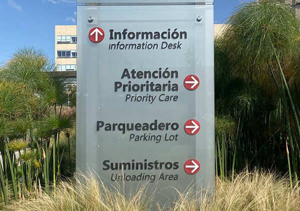
Photo Credit: Julián Osorio
Here, the final location listed on the sign, “suministros,” translates directly as “Supplies,” yet the English version instead reads “Unloading Area.” This subtle shift illustrates how translation is not only about words but also about context. English, often described as a low-context language, privileges clarity and directness, while Spanish, a high-context language, depends more on inference and shared understanding.
The result is that different audiences read the sign differently. A Spanish-speaking delivery driver would see “Supplies” and naturally assume it refers to a delivery point, with details sorted on arrival. An English speaker, however, interprets “Unloading Area” as a clear signal of infrastructure designed to receive shipments. The sign therefore adapts its meaning based on cultural expectations, providing both audiences with the confidence to move in the right direction.
When Symbols Speak
Sometimes the pairing is straightforward, as at JFK, and other times it requires cultural translation, as in Bogotá. But multilingual design also extends beyond words. A third example, in Assisi, Italy, highlights the role of iconography.
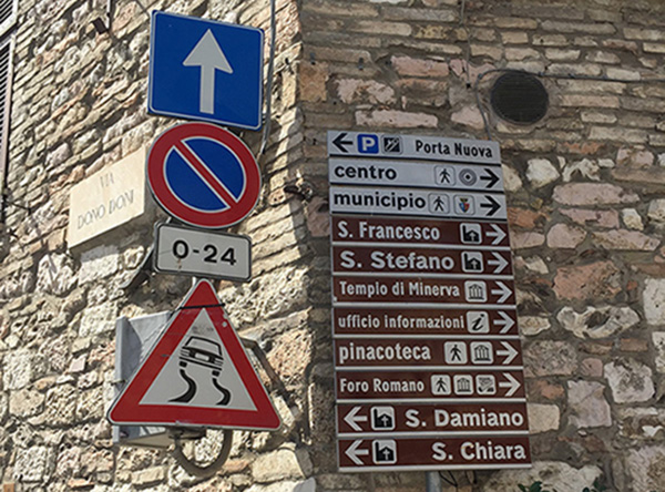
Photo Credit: Julián Osorio
At first glance, a street corner there appears cluttered with competing font sizes and crowded icons. Yet on closer inspection, the system proves highly functional. The icons provide quick orientation, helping visitors understand the direction of services without relying on text. Later research revealed a logic behind the colors as well: brown backgrounds marked tourist destinations, while white indicated public services—an added layer of meaning not immediately obvious to the casual observer.
Seen across these contexts, multilingual signage and wayfinding systems emerge as essential tools for navigating complex environments. On a practical level, they serve individuals who feel more comfortable in one language than another, offering clarity and reassurance. On a cultural level, they signal openness. By dedicating space on permanent signage to multiple languages—and often supplementing words with icons—institutions and cities show that their environments are meant to be legible, welcoming, and inclusive.
In this sense, multilingual signage is more than a matter of practicality. It is also symbolic—a modest but meaningful step toward making public spaces accessible, navigable, and hospitable to people from diverse linguistic and cultural backgrounds.
Clarity, Context, and Connection
Together, the signs from JFK, Bogotá, and Assisi highlight how multilingual communication is never a one-size-fits-all solution—it adapts to context, culture, and audience. Whether through direct translations, nuanced word choices, or universally recognizable icons, each example shows that wayfinding is as much about empathy as it is about clarity. In the end, multilingual signage reminds us that design is not only functional but also human-centered: it helps people move with confidence, feel welcomed across borders, and experience public spaces as places where everyone belongs.