
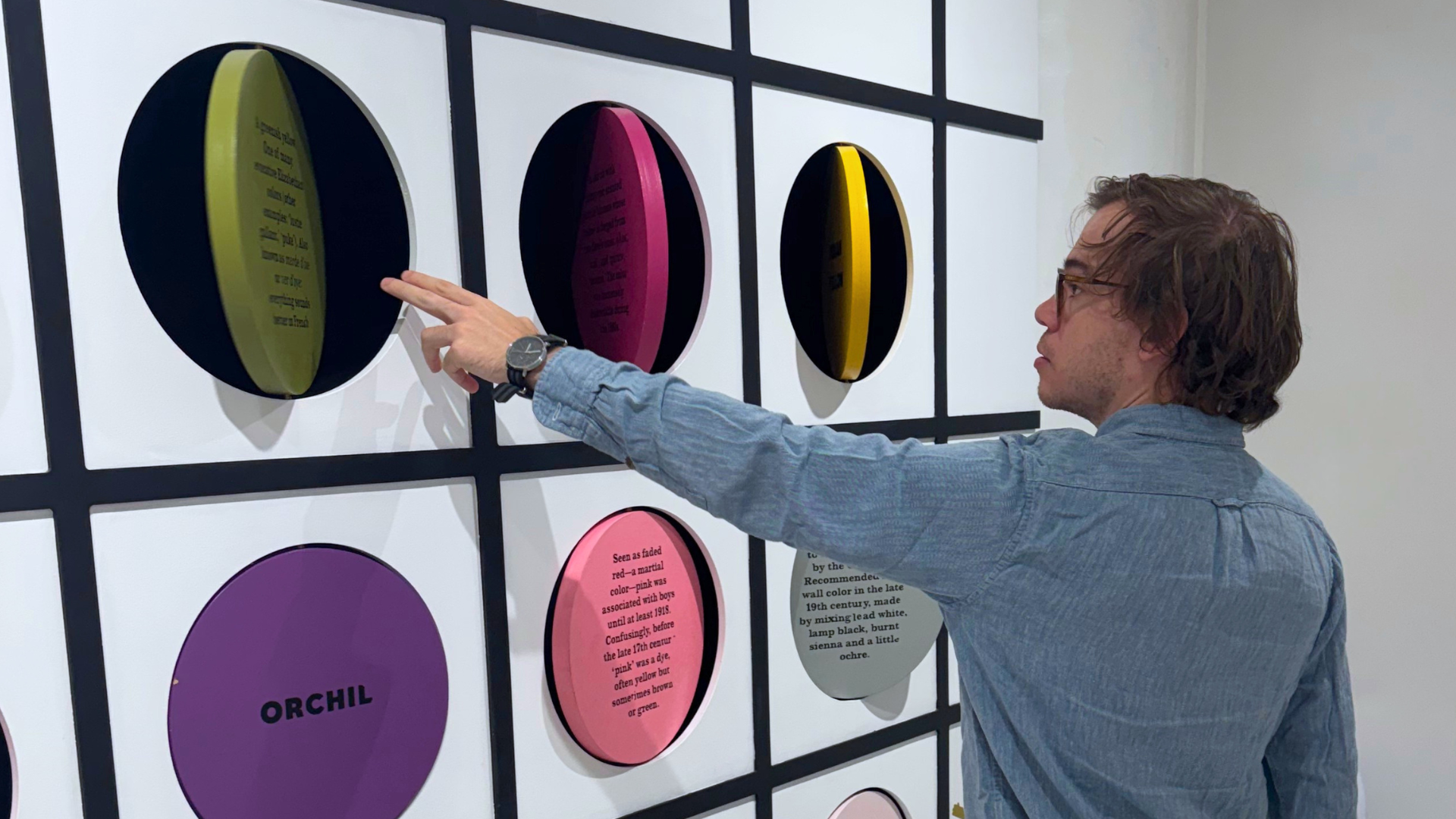
Color is more than just a palette. In the built environment, it is a powerful tool in wayfinding for communicating information, establishing identity, shaping perception, and influencing how people experience space. When thoughtfully deployed, color can add both strategic and emotional value to navigation systems, creating a consistent visual language that reinforces spatial hierarchy while giving a site a distinct personality.
Achieving Your Design Intent
A brand’s color palette is often one of its most recognizable and carefully protected assets. Within the built environment, however, simply applying a brand’s color to walls, signs, graphics, and digital displays isn’t always enough.
Brand guidelines typically provide broad direction using RGB, HEX, CMYK, or Pantone values. While effective digitally or in print, these systems don’t translate to the physical environment. A color will look very different when translated across digital screens, painted walls, illuminated signs, silkscreen inks, etc. Achieving visual uniformity of color across this wide range of media can be challenging and requires coordination between clients, designers, manufacturers, fabricators, lighting designers, and other key stakeholders. Accurate specification is the bridge that connects design intent to reality.
Color as a Tool for Information
Color becomes even more powerful when it moves beyond identity to communicate information. Within a wayfinding system, color is one way to establish hierarchy, differentiate destinations, identify zones, and reinforce routes. It provides an additional layer of information that people process quickly, often without having to stop and read every word on a sign.
The PANYNJ Wayfinding system provides a strong example. Its color palette of yellow, purple, green, and blue distinguishes different categories of information and functions of the airport. Yellow, for example, identifies flight-related information like gate numbers.
Once a visitor understands the system, they can scan for these colors to recognize the types of information they need. Strategically using color helps visitors build a mental map of the site they are in. Repeated color cues throughout all the different touchpoints in the user experience provide reassurance and maintain confidence. In high-stimulus environments like airports, hospitals, and transit environments, this can reduce cognitive load and help people make decisions more efficiently and even improve comprehension for non-native English speakers.
But color should never be asked to do all the work. A well-designed wayfinding system combines color with typography, symbols, words, shapes, spatial cues, and architectural elements. This is especially important for accessibility. If color is the only way a user can distinguish between two destinations, the system creates unnecessary barriers for people with color-vision deficiencies and others who may not perceive color as intended. The most effective systems use color as an additional layer of information, not the sole source of information.
Color as a Tool for Experience
While guiding users to a destination is a very practical application, color can also be used for something less functional: creating an emotional response. Color makes a place have a personality. In these applications, the objective isn’t necessarily to help someone find their destination; instead, color becomes part of the experience.
At Color Factory in NYC, visitors encounter a series of installations that explore the emotional, sensory, and cultural associations of color. The experience demonstrates how powerful color can be when it becomes the primary material of an environment. A monochromatic pastel ball pit, for example, creates an unusual visual experience precisely because it is so different from what we typically encounter in the built environment. Rather than using color to identify a destination or communicate information, the color itself becomes the destination.
The challenge is knowing how to balance all the roles that color can play within the same system. A highly saturated color might be exactly what is needed to identify an important destination, while a quieter tone may be more appropriate for creating a calm environment. Sometimes color should direct attention; other times, its job is simply to establish an atmosphere.
Ultimately, using color effectively in the built environment isn’t about choosing the “right” color. It’s about understanding what the color needs to do. When color is treated as a strategic tool rather than an aesthetic afterthought, it can help people navigate more intuitively, understand complex environments more quickly, connect with a brand more meaningfully, and experience a place more memorably.